design & direction

Shiminly Visual Identity2020

Shiminly makes curriculum for students and teachers around the world. When I developed its visual identity in 2020, I wanted it to feel open and friendly to all of them, so I kept the logo and type rounded, built the palette on green and navy, and filled the photography with people who looked glad to be there.
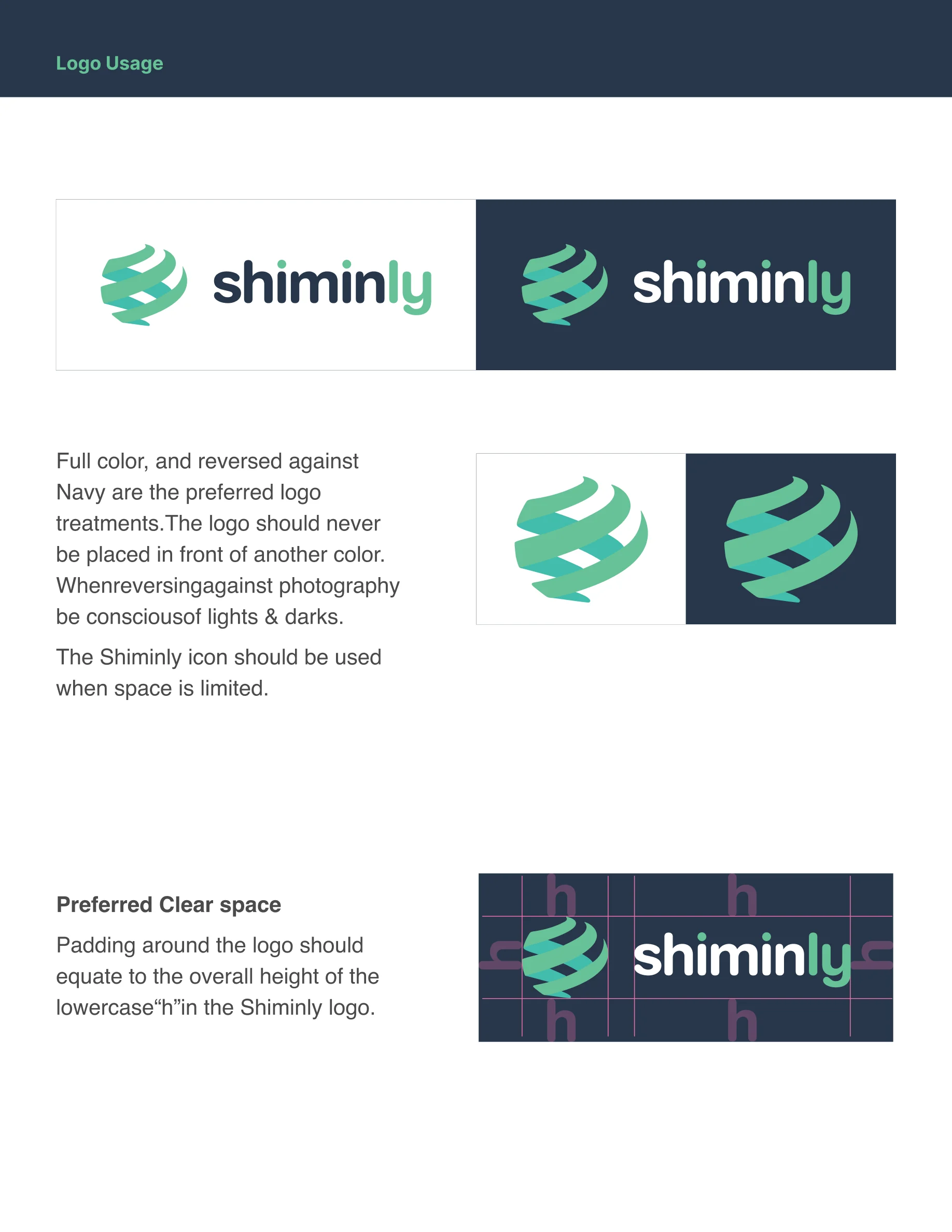
The Shiminly logo reversed out of navy: a globe of green and turquoise swooshes beside the shiminly wordmark, its ly in green
The Shiminly logo in full color on white
The Shiminly icon alone on navy, for small spaces
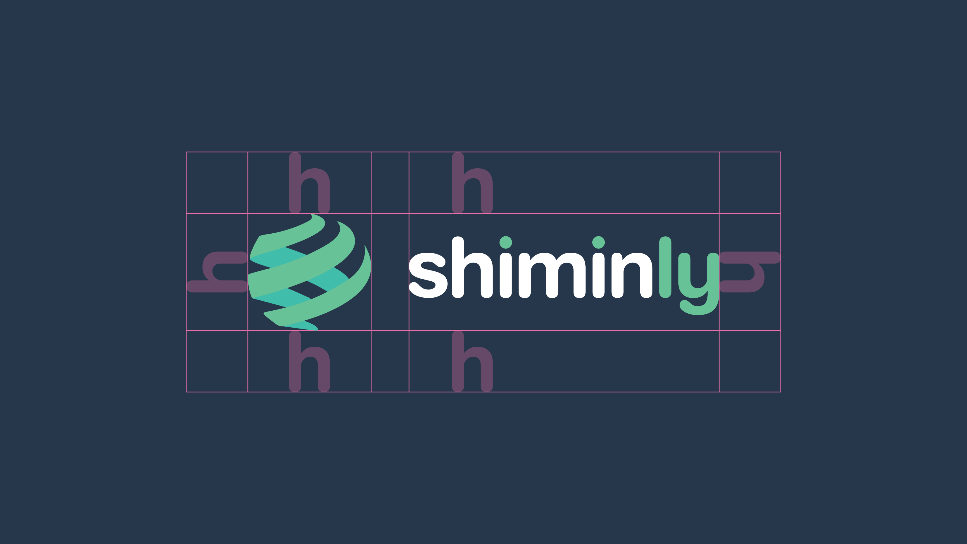
The Shiminly logo on navy with its clear space marked in pink: the height of the wordmark's lowercase h on every side
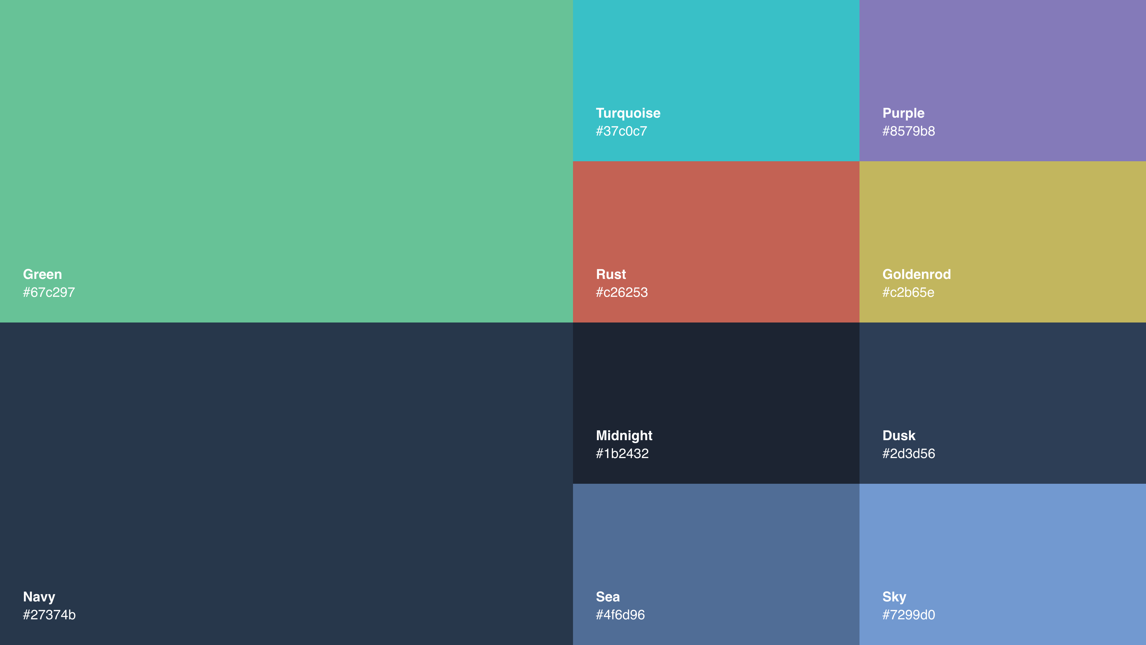
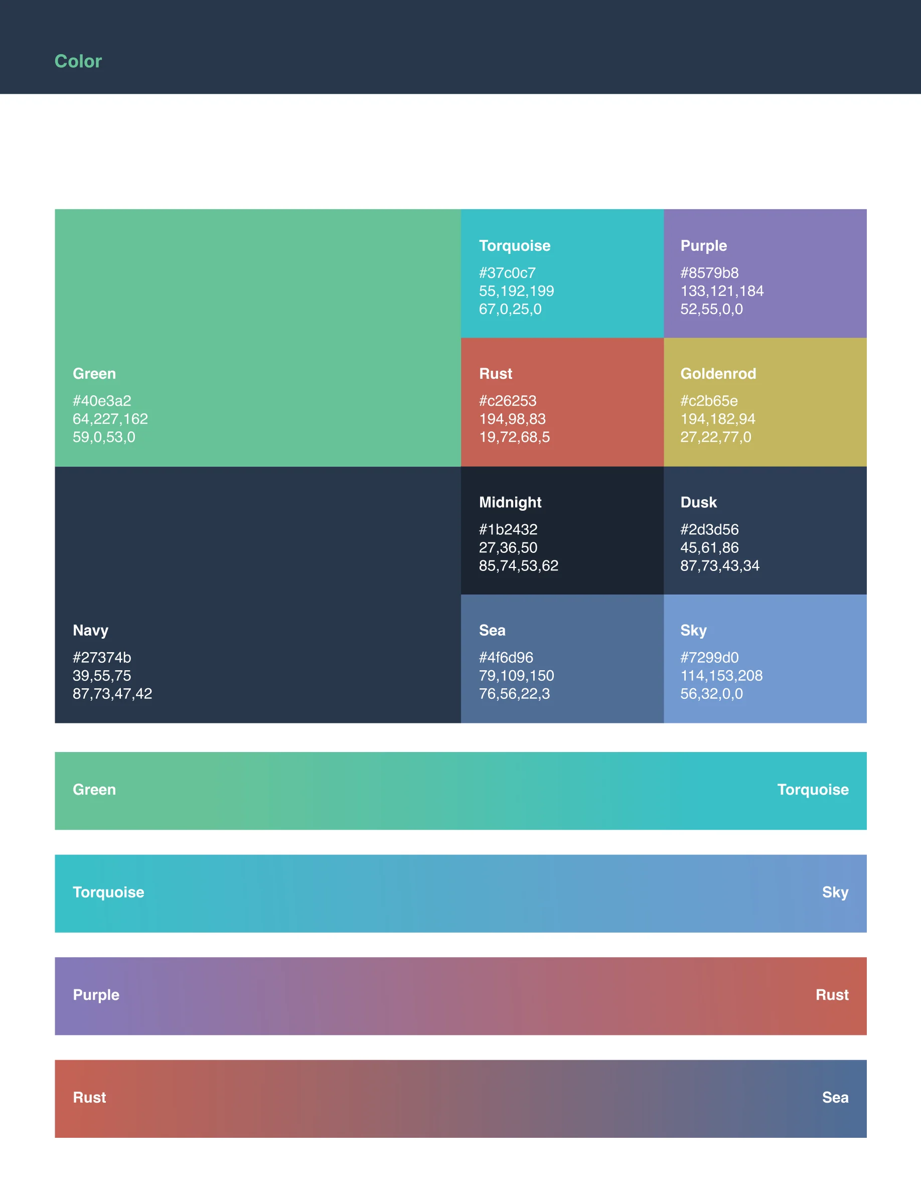
The Shiminly palette with each color's name and hex value: Green and Navy, then Turquoise, Purple, Rust, Goldenrod, Midnight, Dusk, Sea and Sky
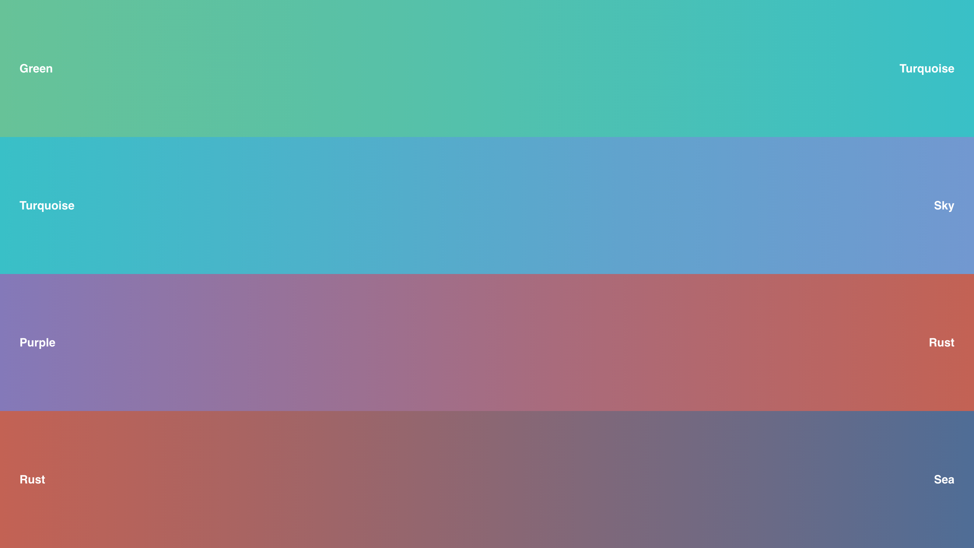
The four Shiminly gradient pairs: Green to Turquoise, Turquoise to Sky, Purple to Rust and Rust to Sea
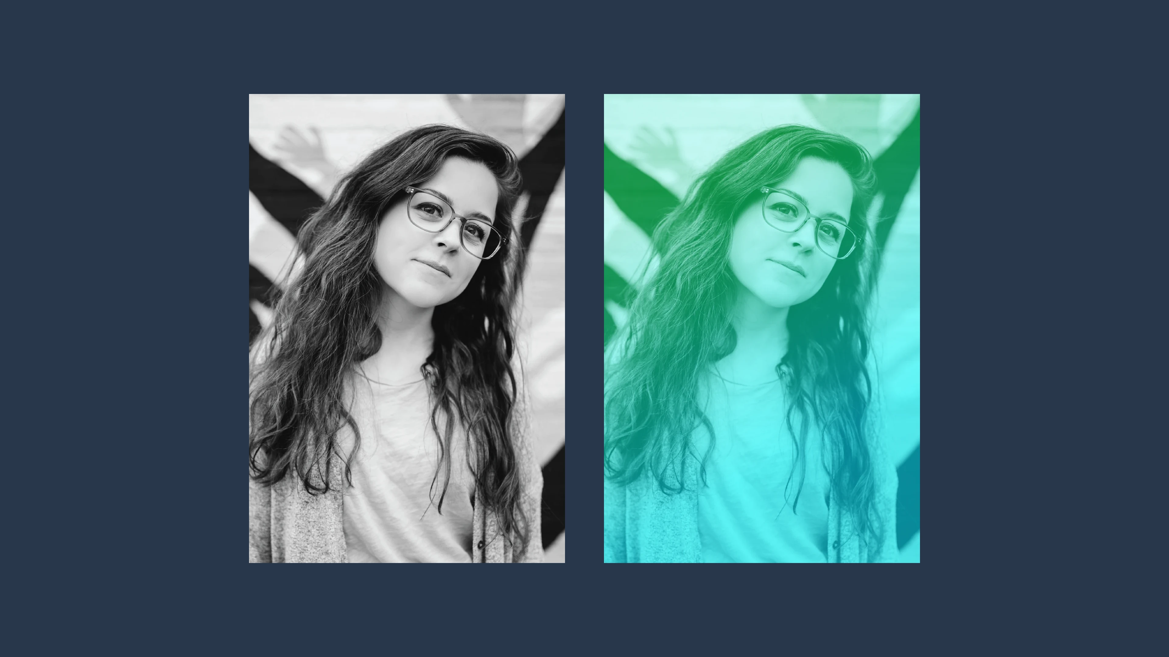
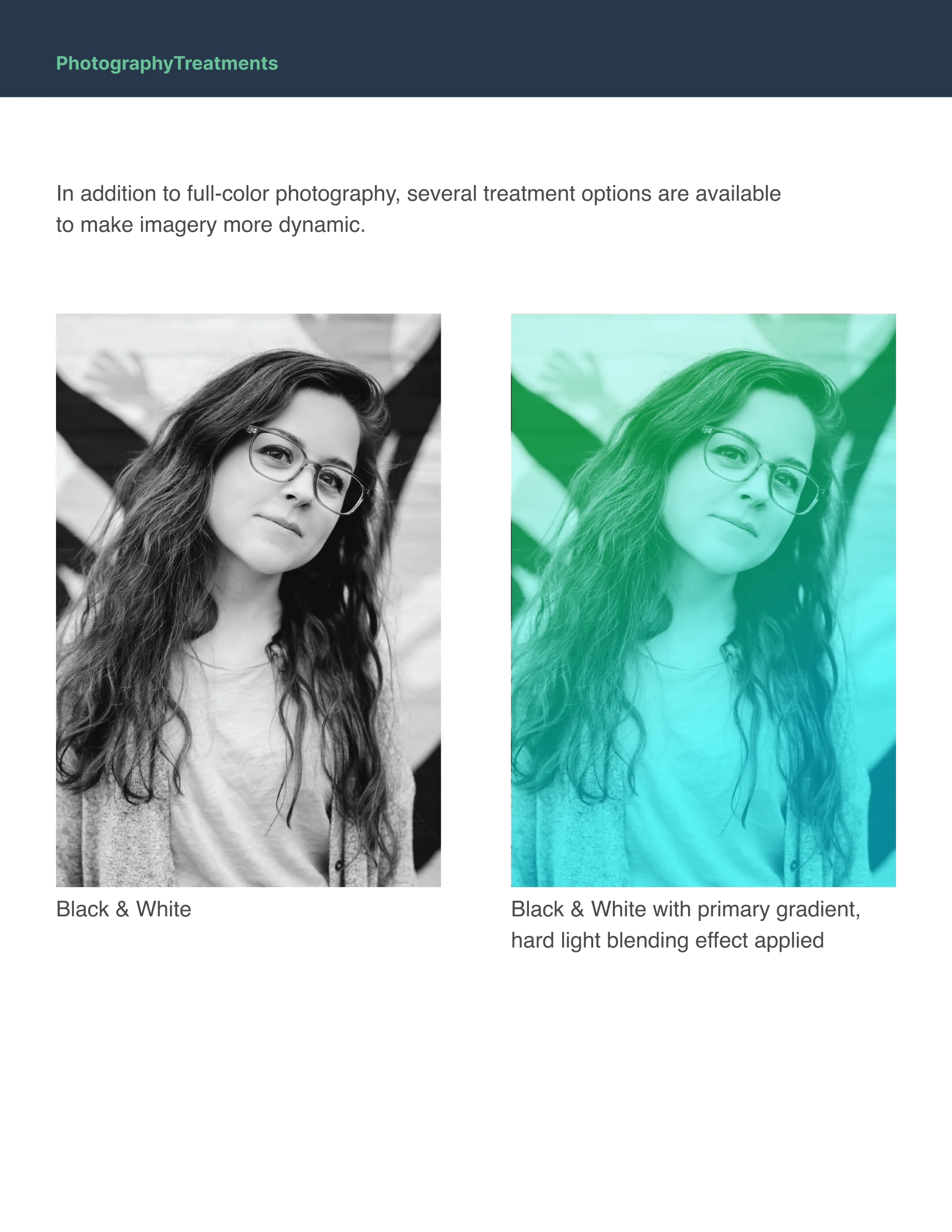
The same portrait in the guide's two photo treatments, on navy: black and white, and black and white with the green-to-turquoise gradient in hard light
Shiminly style guide: the cover, Visual Style Guide, summer 2020
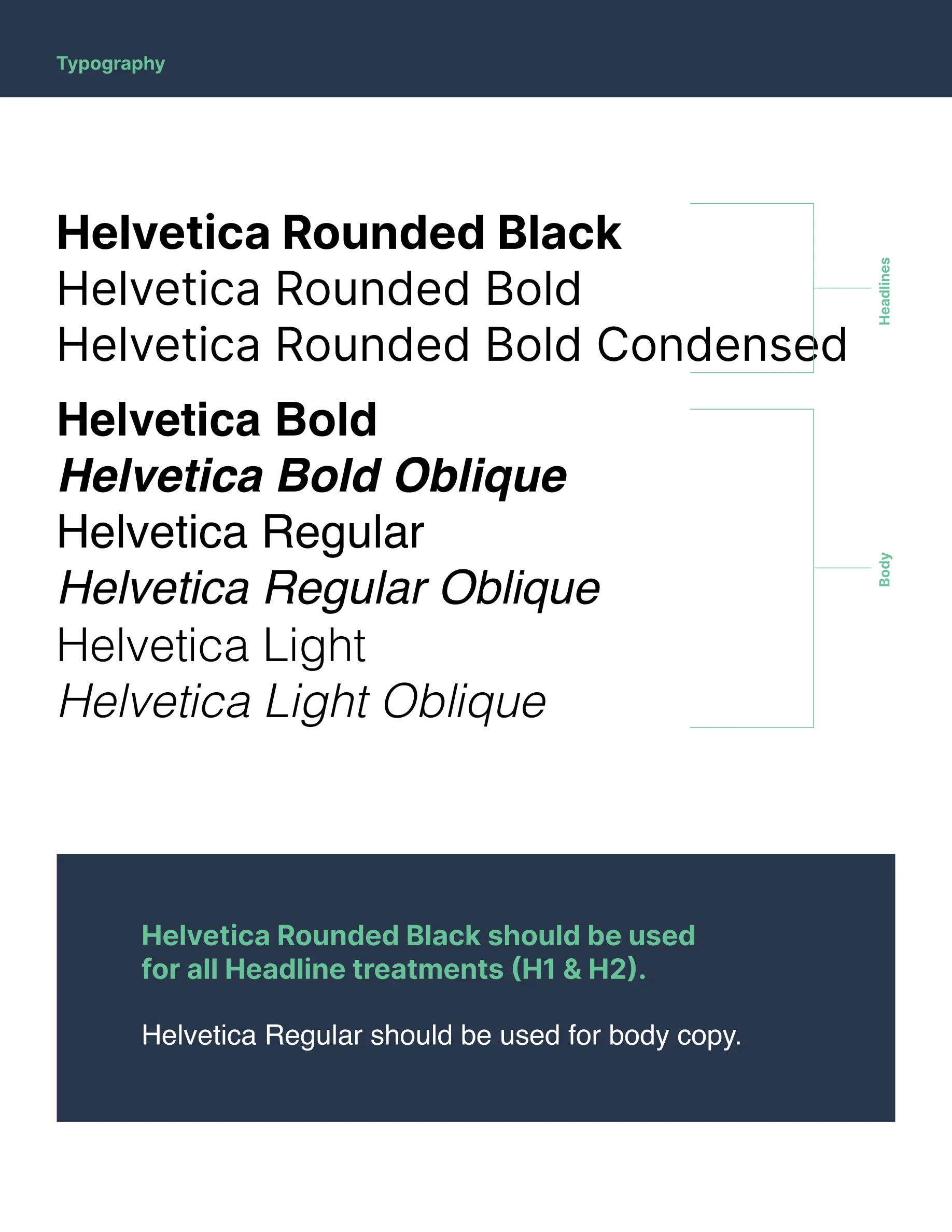
Shiminly style guide: typography, Helvetica Rounded for headlines and Helvetica for body copy
Shiminly style guide: color, the palette and its gradient pairs
Shiminly style guide: logo usage, full color, reversed on navy, the icon alone and clear space
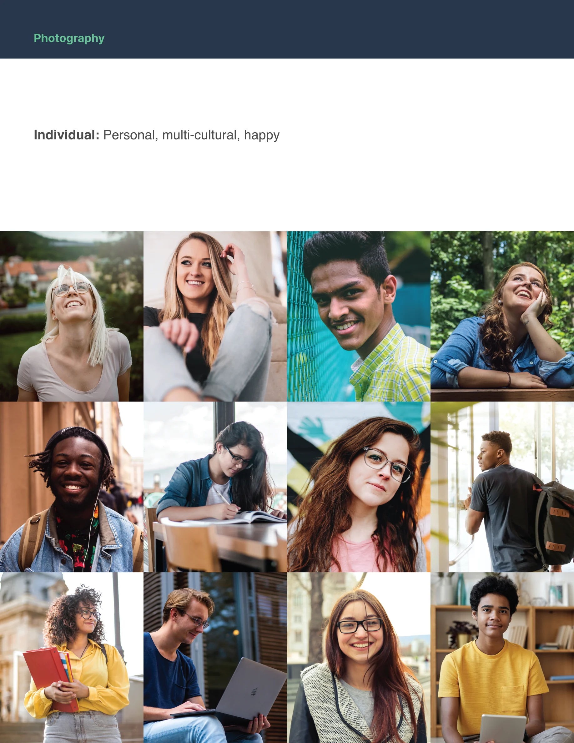
Shiminly style guide: photography of individuals, personal, multicultural and happy
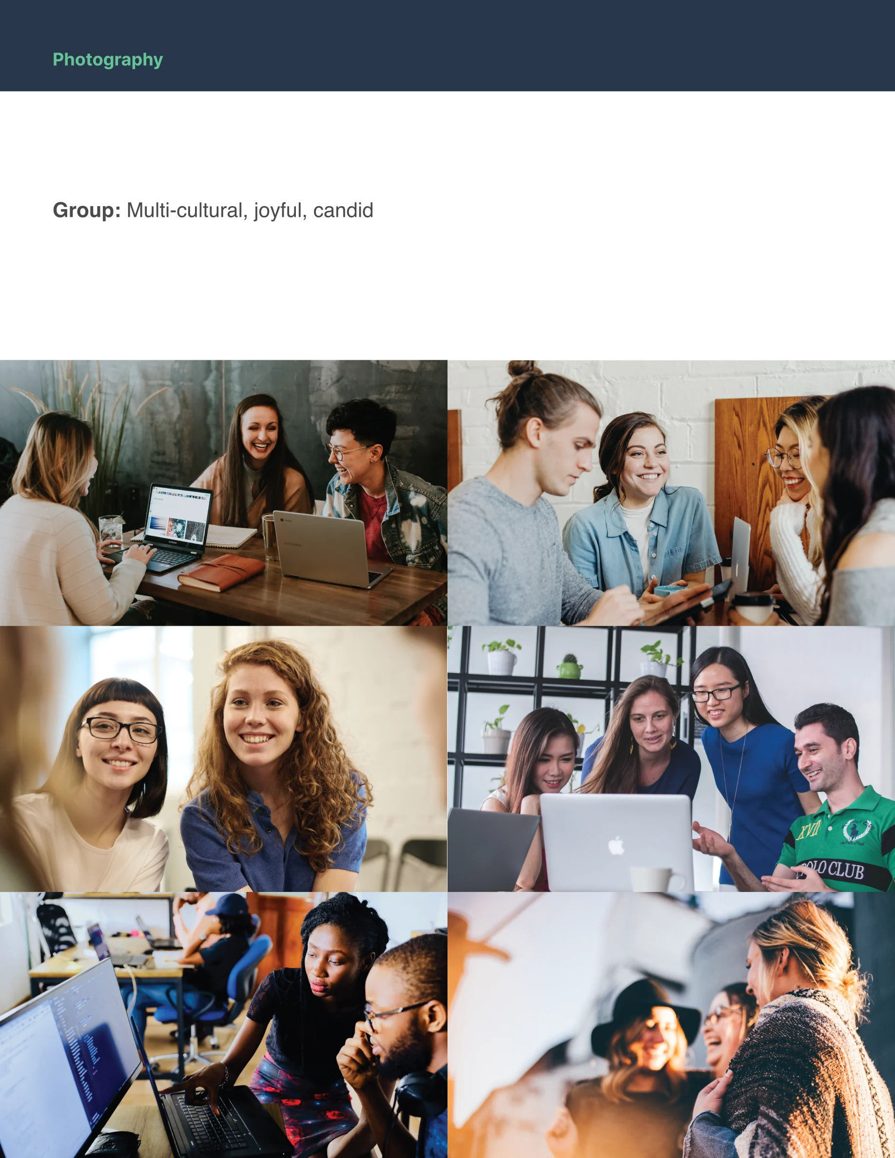
Shiminly style guide: photography of groups, multicultural, joyful and candid
Shiminly style guide: photography treatments, black and white, and black and white with the primary gradient
Shiminly style guide: the back cover, the logo on navy