design & direction

Dialpad Rebrand2025

Dialpad's 2025 rebrand rested on one belief: an investment in employees is an investment in customers. The guidelines put people at the center of an AI brand and planned every piece around the customer journey, from the first billboard to the product itself.

  • Design lead: Zach Allott
  • Design: Magali Morales, Eugenia Canepa, Melissa Egan, Sol Noriega
  • Motion: Jack Bryant Lacson
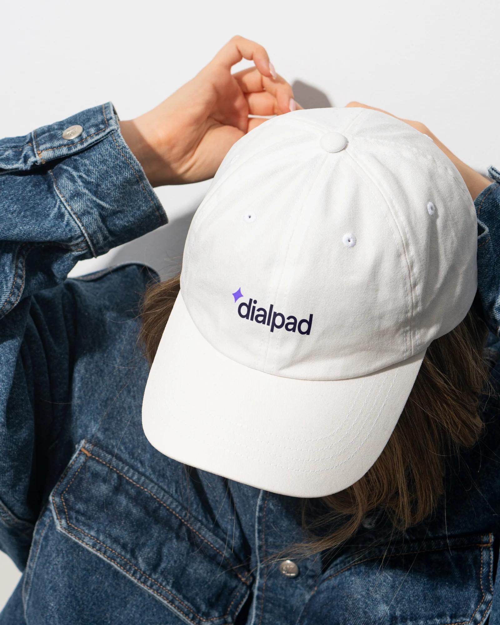
A white cap with the Dialpad wordmark, worn with a denim jacket
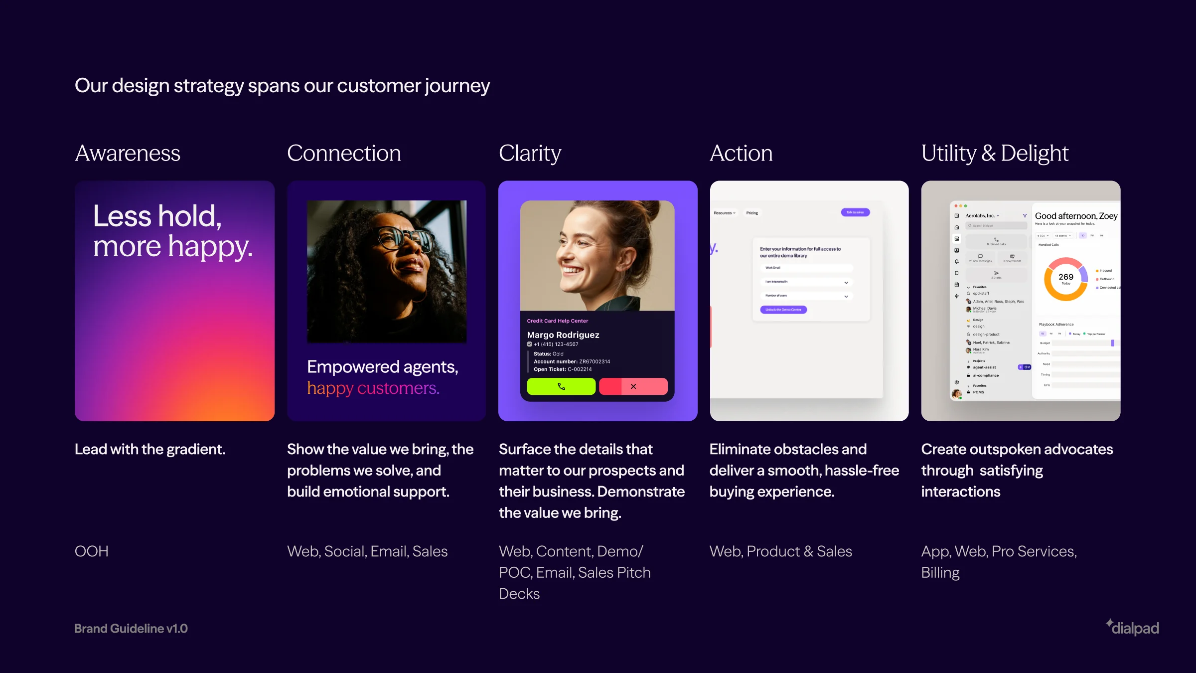
The design strategy across the customer journey: awareness, connection, clarity, action, and utility and delight
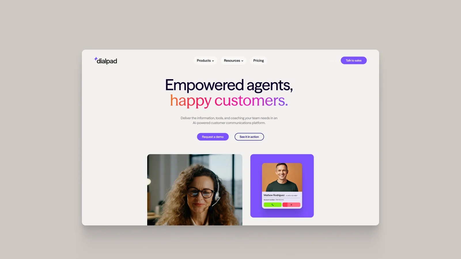
A support agent in a headset smiling at her screen
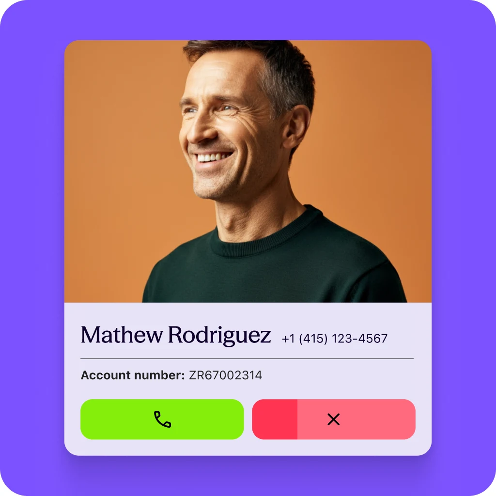
An incoming call card for Mathew Rodriguez on a purple tile, with answer and decline buttons
A studio portrait of a smiling woman on a pink backdrop
The Dialpad wordmark and its purple spark on deep blue

The icon paired the keypad at the heart of the product with the spark of its AI, and the same shapes showed Dialpad connecting businesses with their customers.
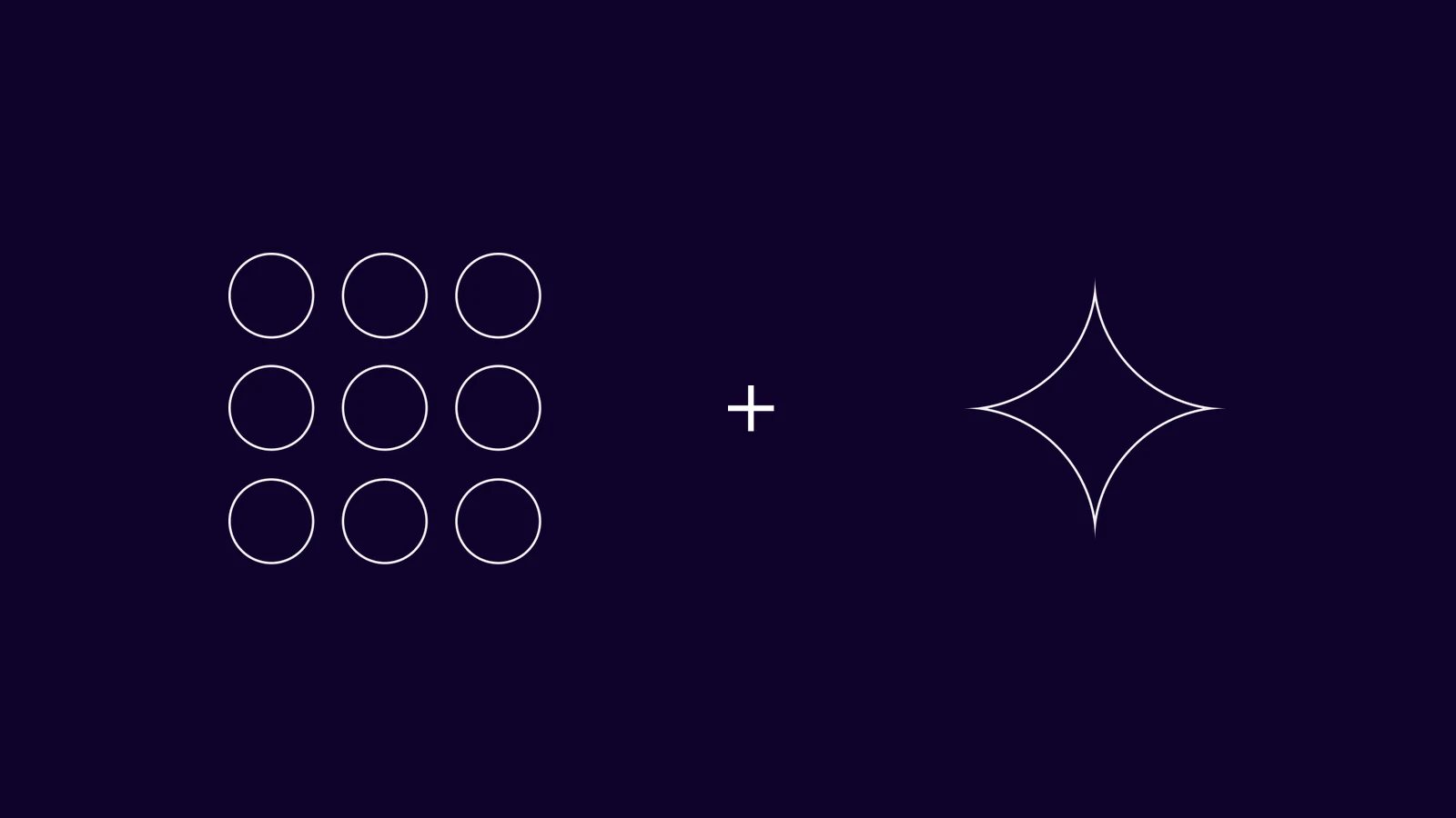

The keypad's nine circles, a plus sign and the AI spark, drawn in line
Four overlapping circles for businesses and customers, with the spark where they meet
The d icon in gradient, dark and light versions, as square app icons and round avatars
The purple spark alone on tan
The one-color wordmark in light tan on purple
The one-color wordmark on the Dialpad gradient
Product lockups on deep blue: Dialpad Connect, Dialpad Support and Dialpad Sell
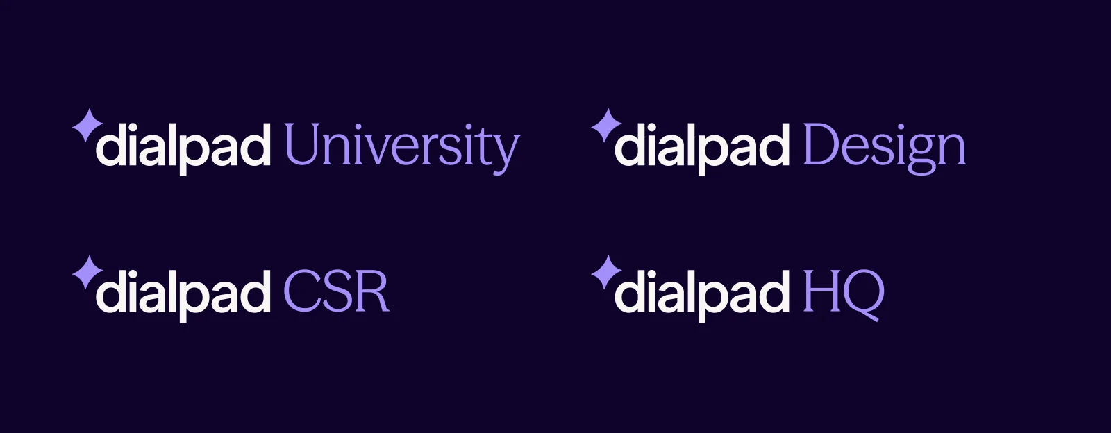
Company lockups on deep blue: Dialpad University, Design, CSR and HQ

The gradient stood for optimism and led at the top of the journey. Purples and neutrals carried everything after it.

The Dialpad gradient, deep blue through purple and pink to orange
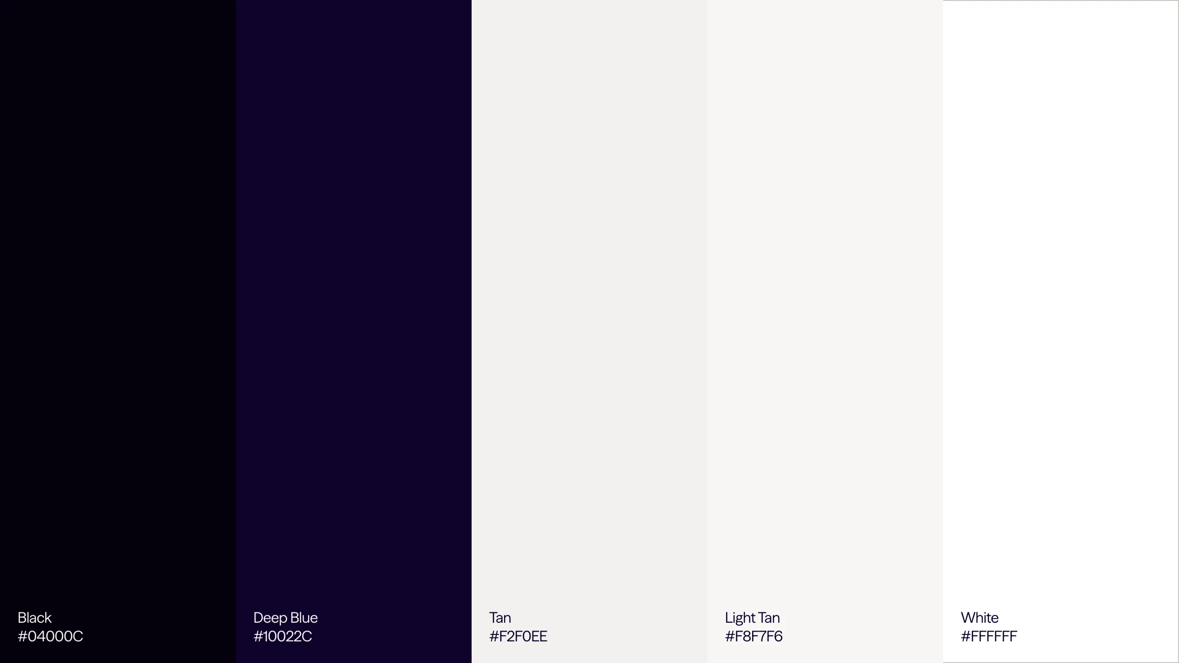
The primary neutrals as color fields: Black #04000C, Deep Blue #10022C, Tan #F2F0EE, Light Tan #F8F7F6 and White #FFFFFF
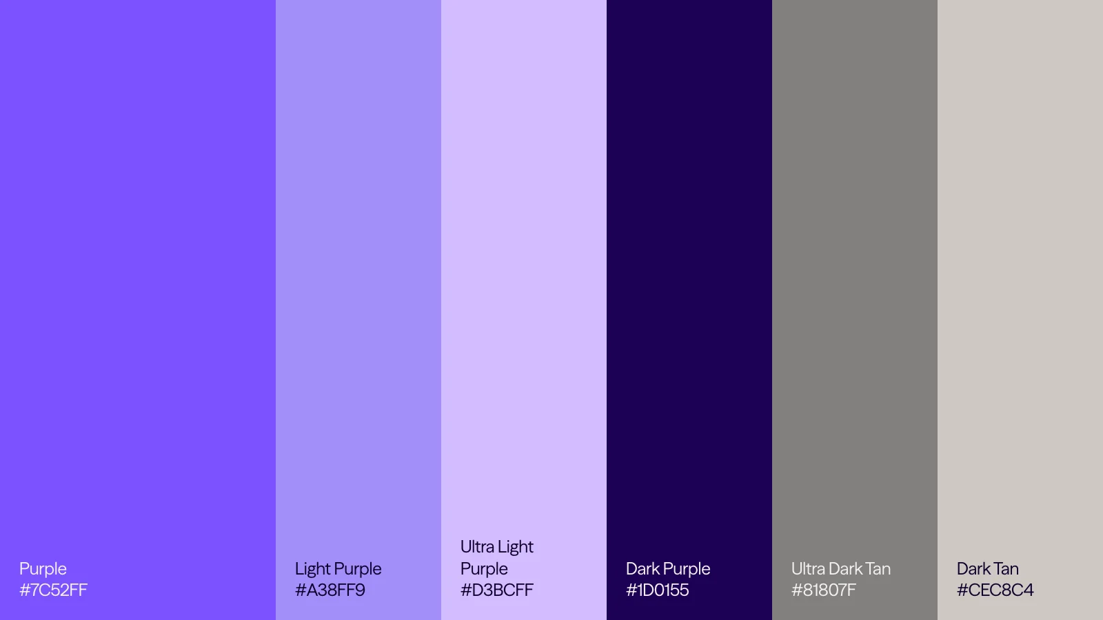
The secondary colors: Purple #7C52FF, Light Purple #A38FF9, Ultra Light Purple #D3BCFF, Dark Purple #1D0155, Ultra Dark Tan #81807F and Dark Tan #CEC8C4
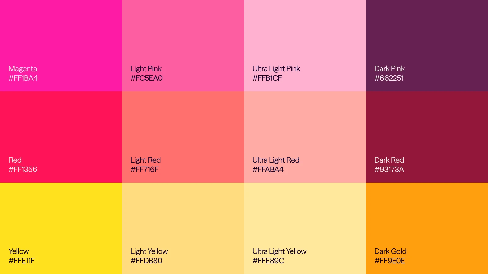
The limited tertiary warm tones in pink, red and yellow families, each from its brightest to its darkest
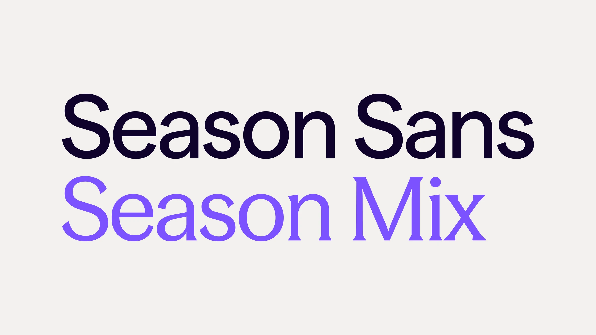
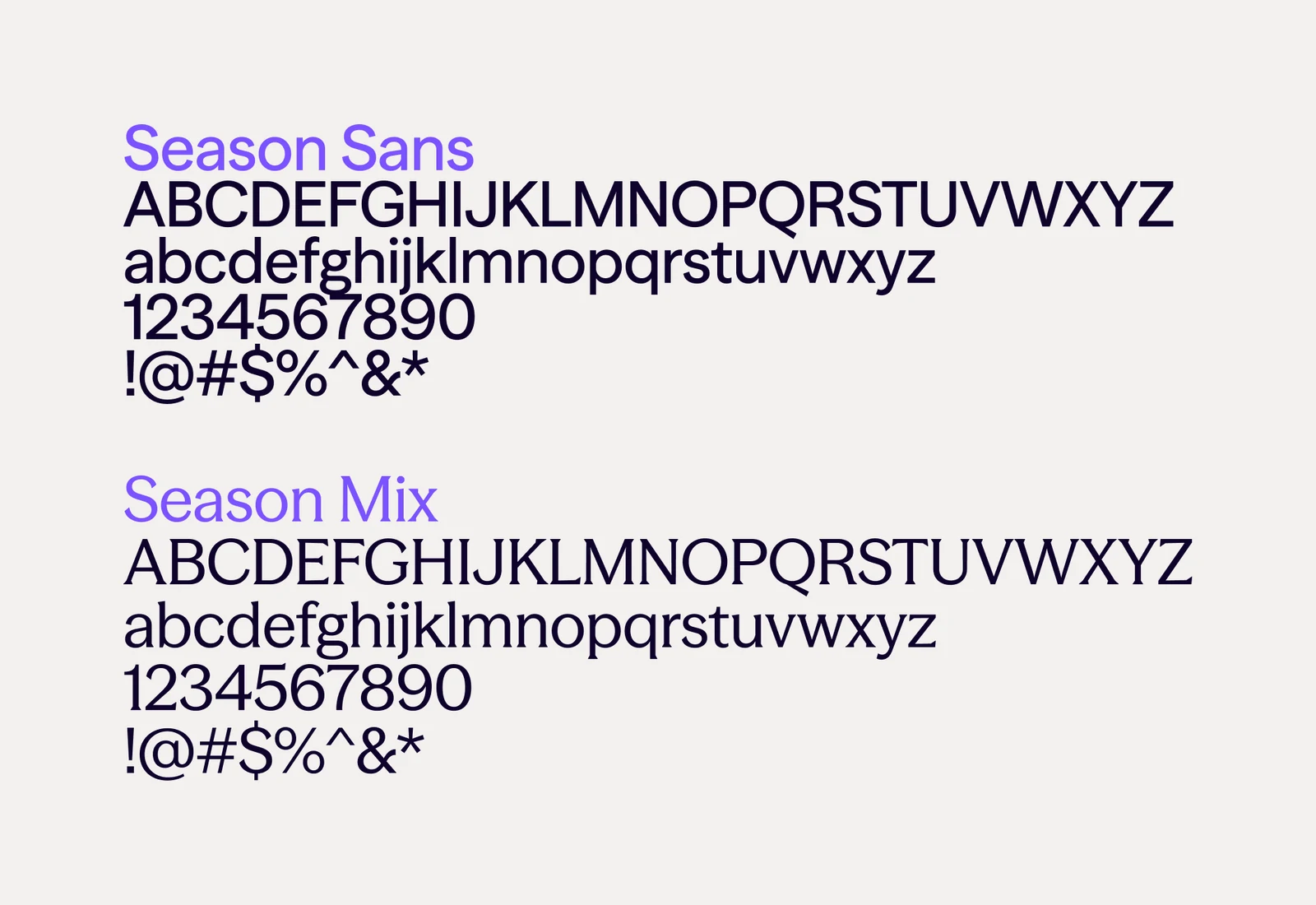
Season Sans in deep blue above Season Mix in purple, set large
The Season Sans and Season Mix character sets: capitals, lowercase, figures and symbols
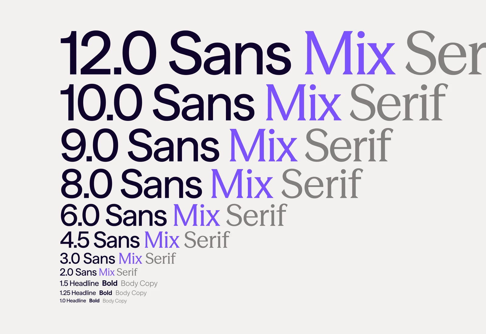
The type scale from 12.0 down to 1.0, each step set in Sans, Mix and Serif
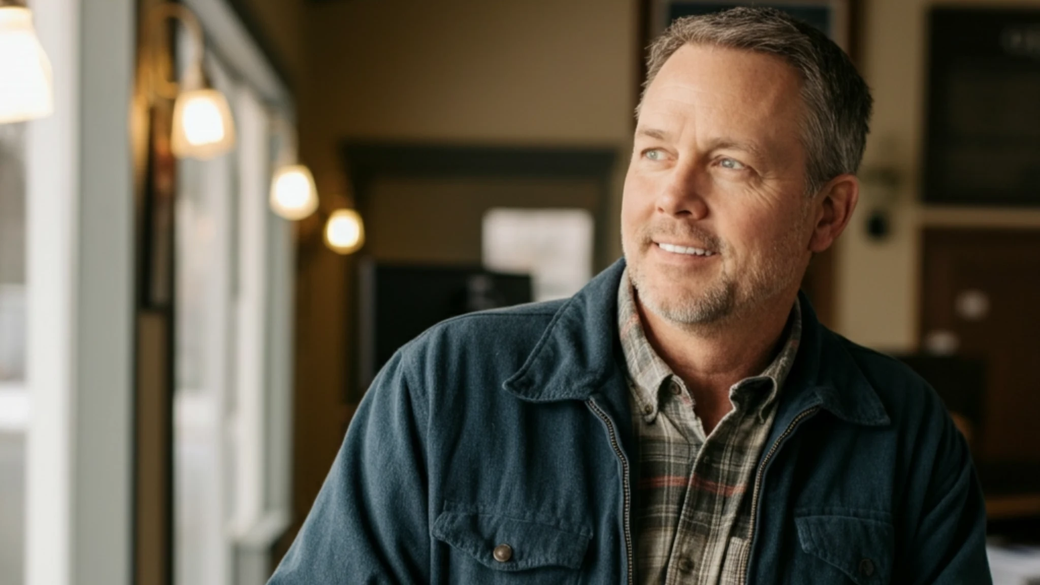
A business owner in a denim jacket leaning by a window in his shop

The photography was portraiture of the people Dialpad served: business leaders, support agents and their customers, shot warmly through a working day.


A smiling man in a green sweater by an office window
A studio portrait of a woman seated on a chair against burgundy
A studio portrait of a smiling bald man in glasses against tan

Product UI appeared at three levels of detail, from a simplified card at first contact to the literal interface when someone was ready to buy.
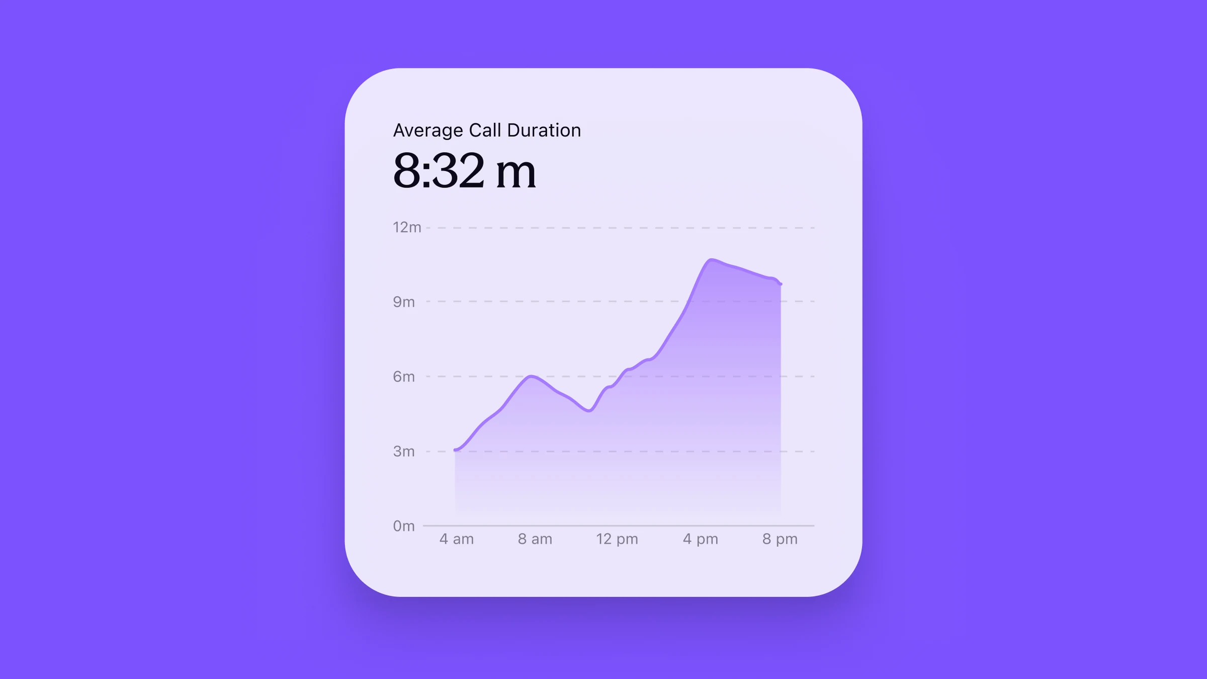
A simplified average call duration card on purple: 8:32 m
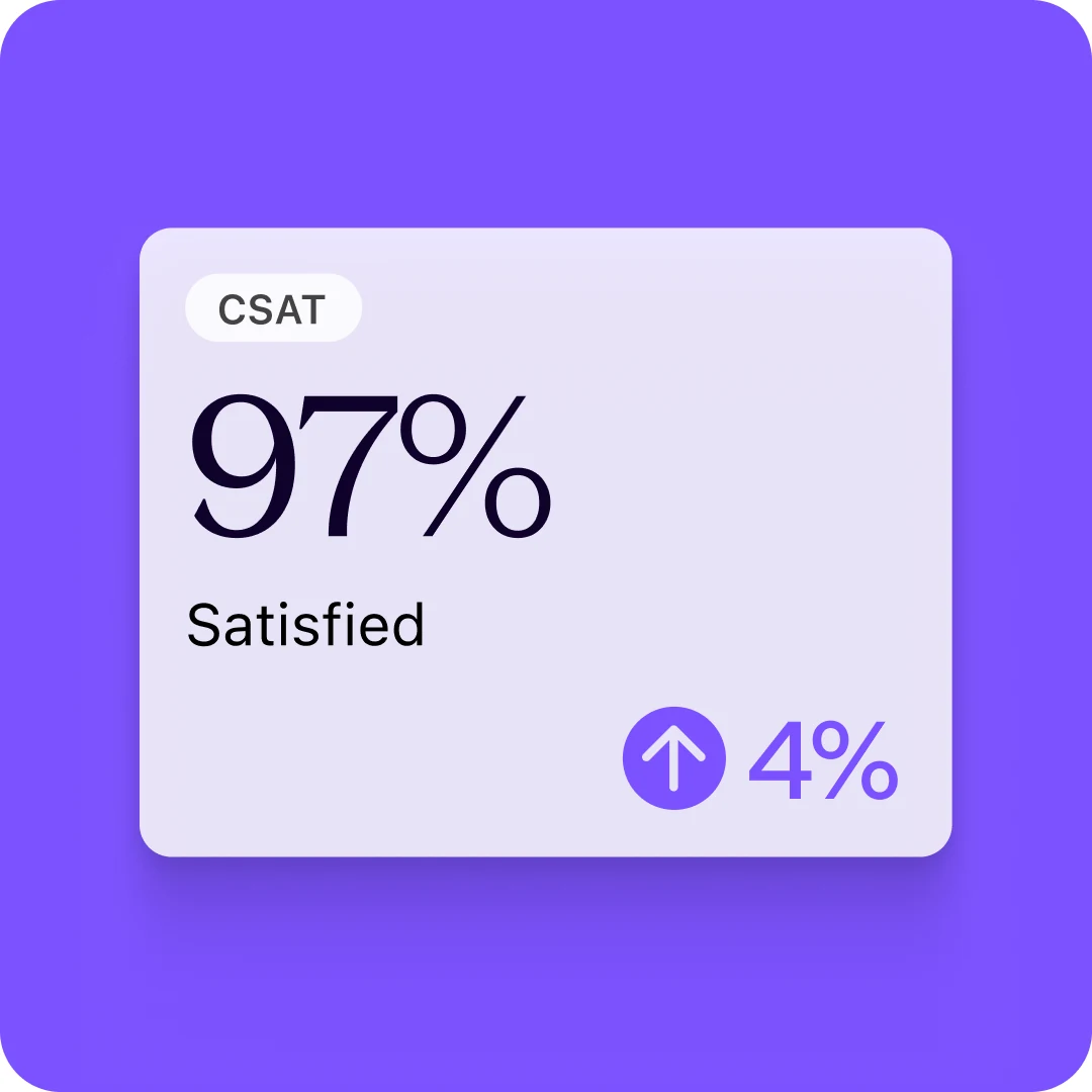
A simplified CSAT card: 97% satisfied, up 4%
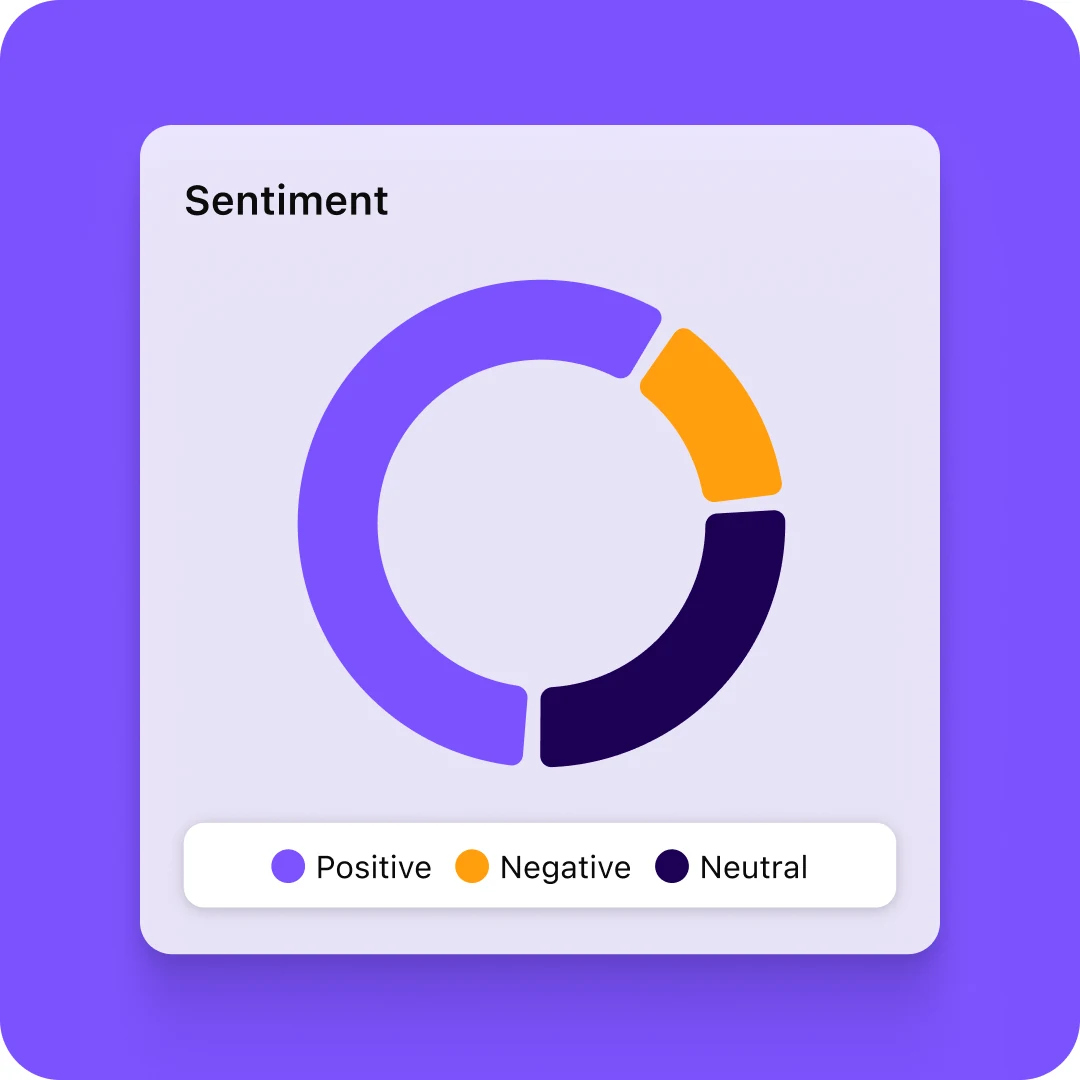
A simplified sentiment card with a donut chart
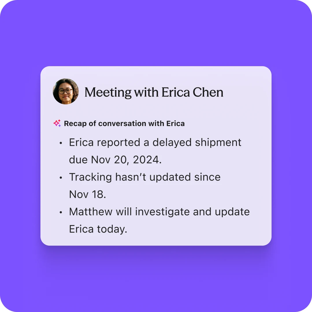
An AI recap card for a meeting with Erica Chen
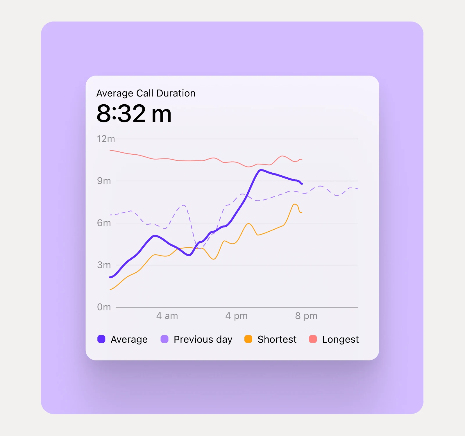
Focused UI on lilac: one panel of average call duration against the previous day, shortest and longest
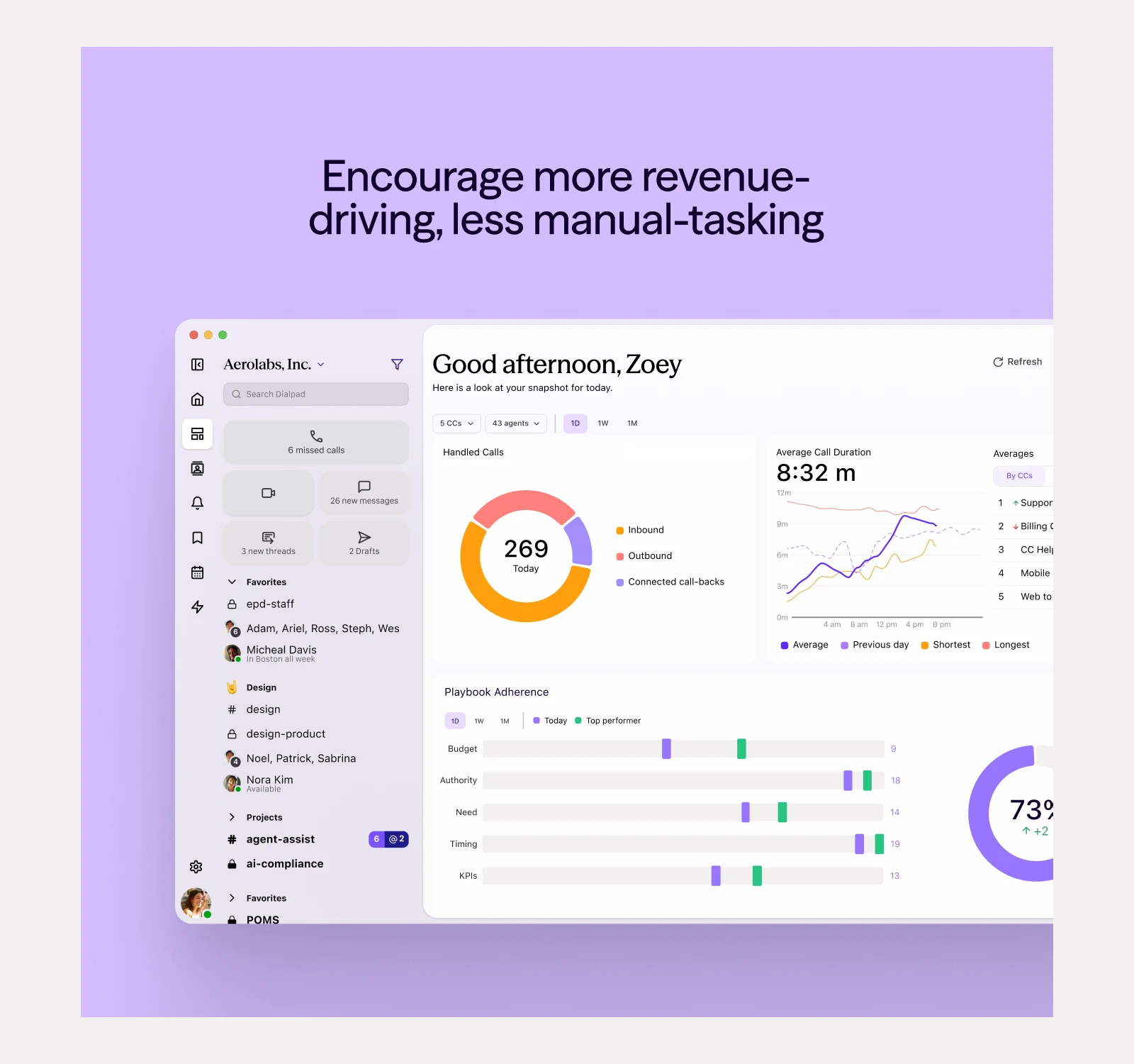
Literal UI on lilac: the supervisor dashboard under the line Encourage more revenue-driving, less manual-tasking
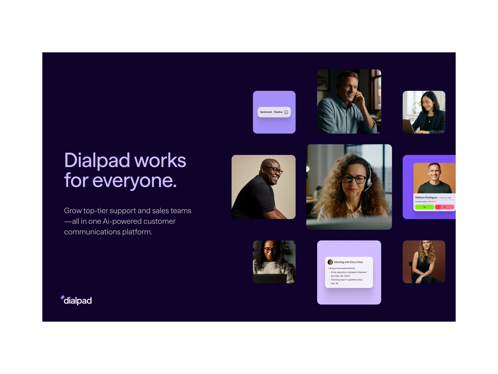
A platform layout on deep blue: Dialpad works for everyone. beside a grid of people and UI
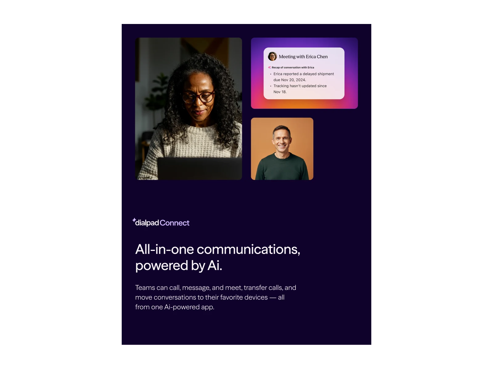
A Dialpad Connect layout on deep blue: All-in-one communications, powered by Ai.
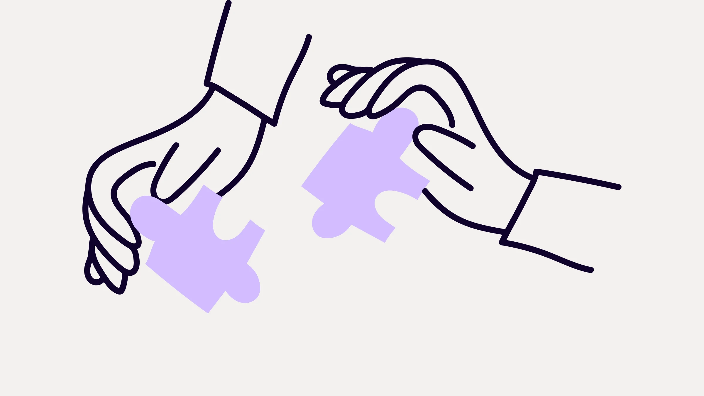
Line-drawn hands fitting two purple puzzle pieces together
A spot illustration of a hand holding up a smiling screen, on light tan
The same spot illustration on light purple
The same spot illustration on deep blue
A metaphor illustration of a compass
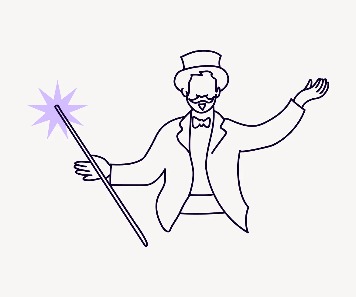
A metaphor illustration of a magician with a wand
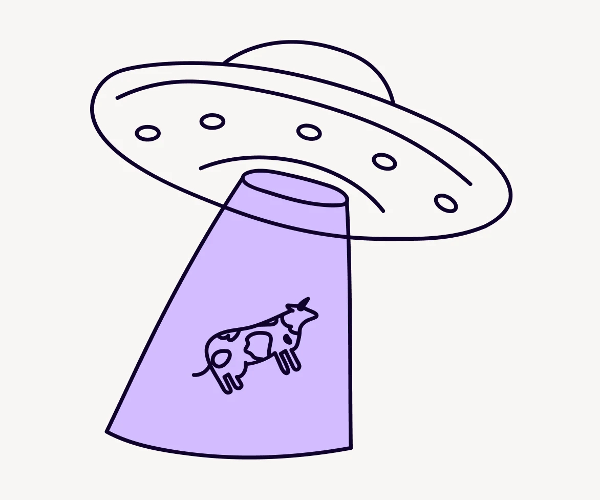
A metaphor illustration of a UFO beaming up a cow
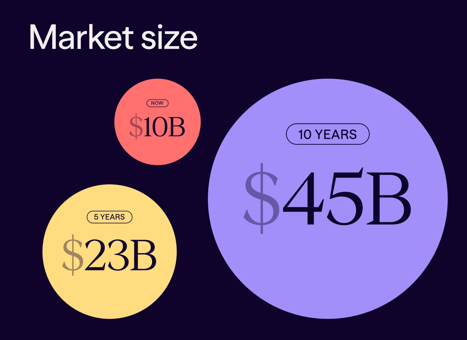
Market size as three circles: $10B now, $23B in five years, $45B in ten
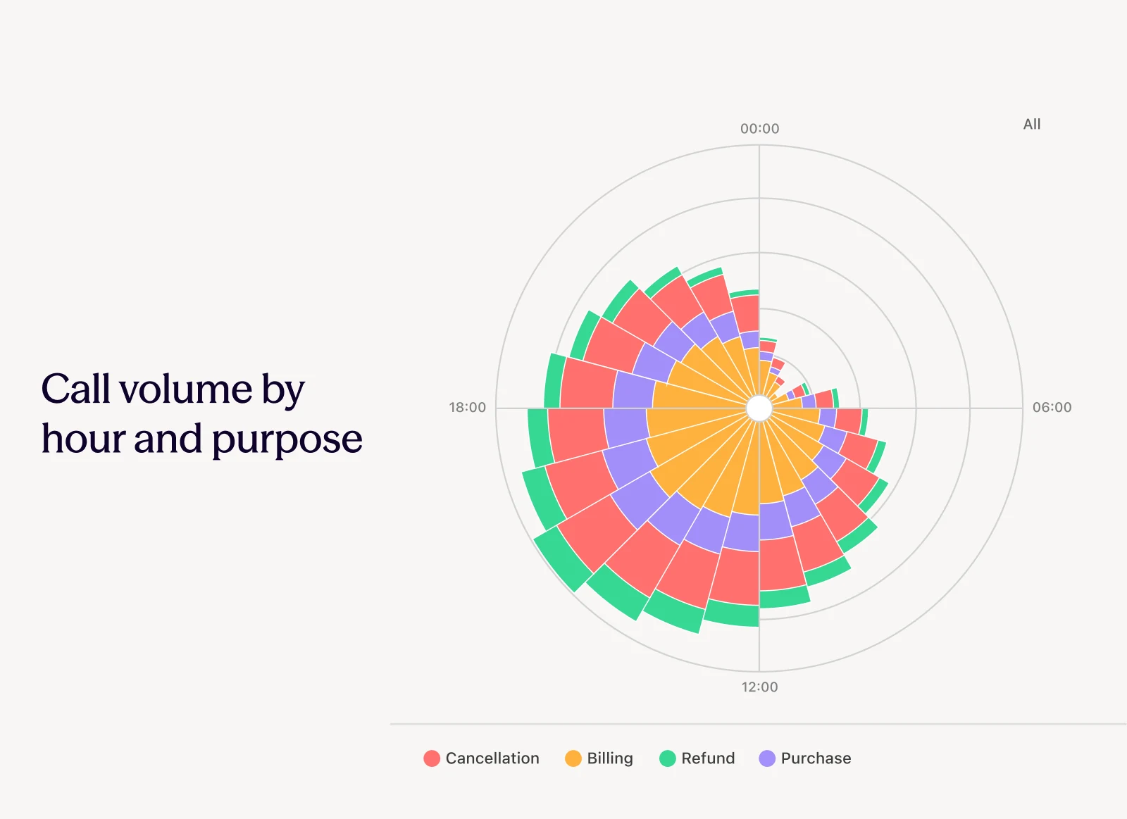
A polar chart of call volume by hour and purpose
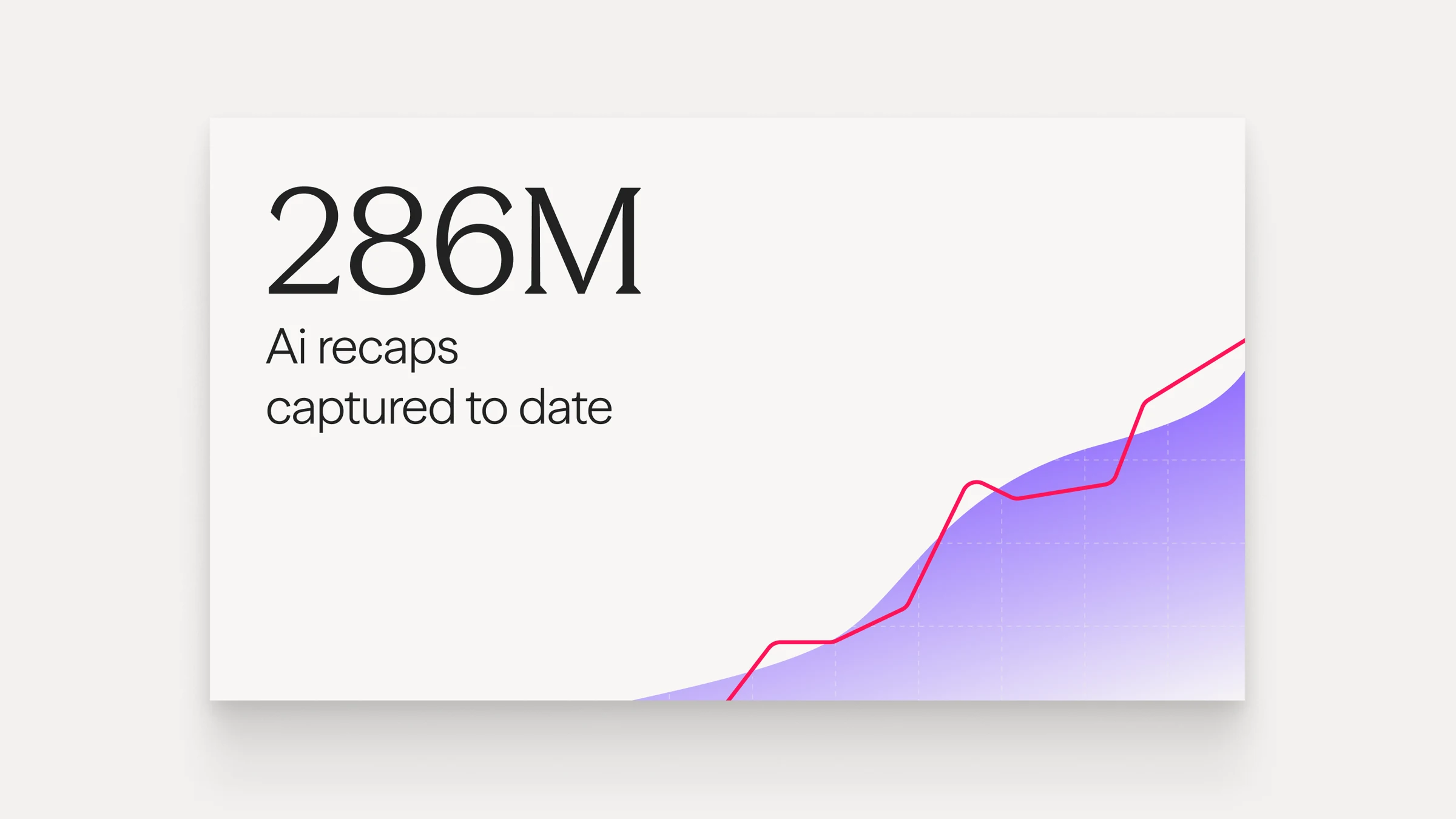
286M AI recaps captured to date, over a rising purple chart
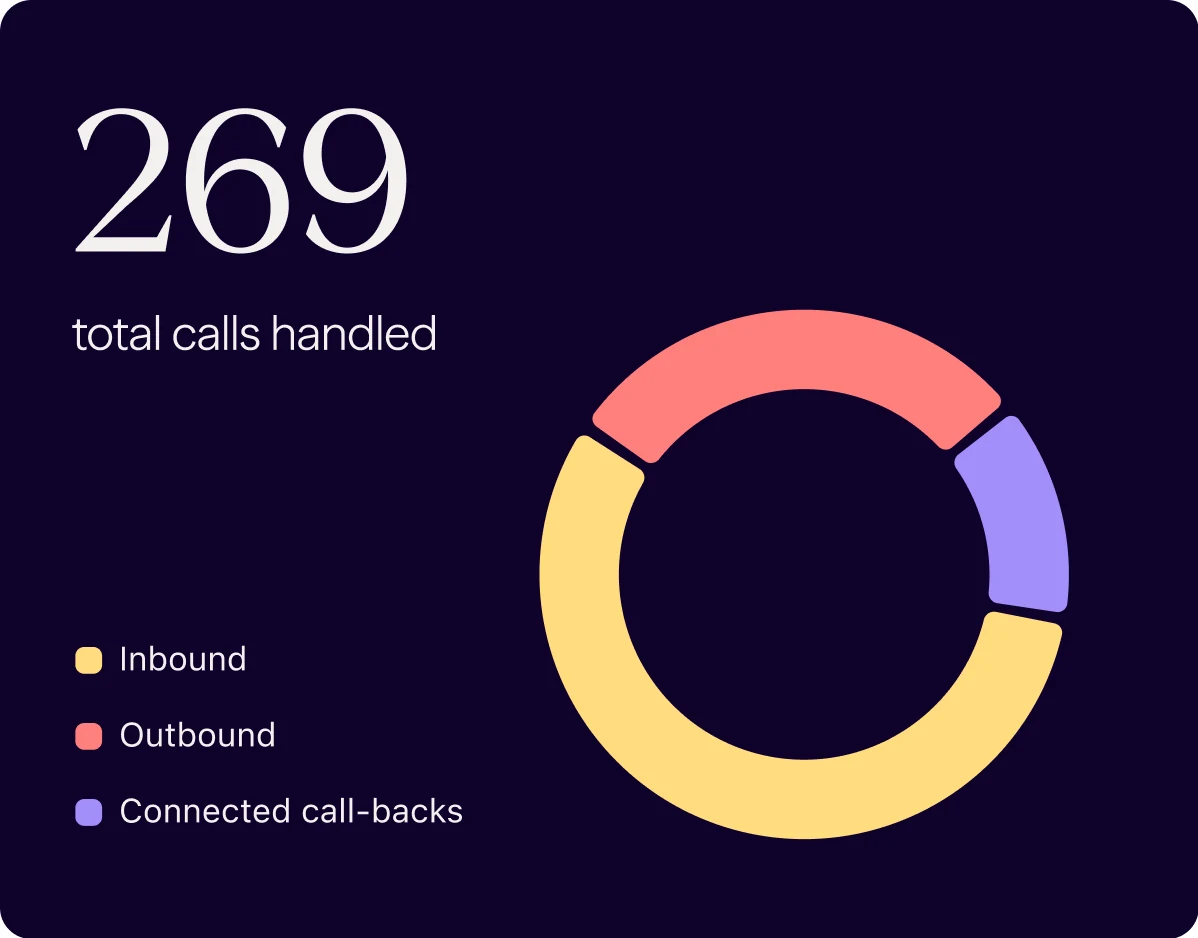
269 total calls handled, with a donut chart by call type
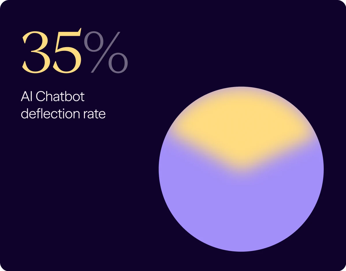
A 35% AI chatbot deflection rate over a gradient circle

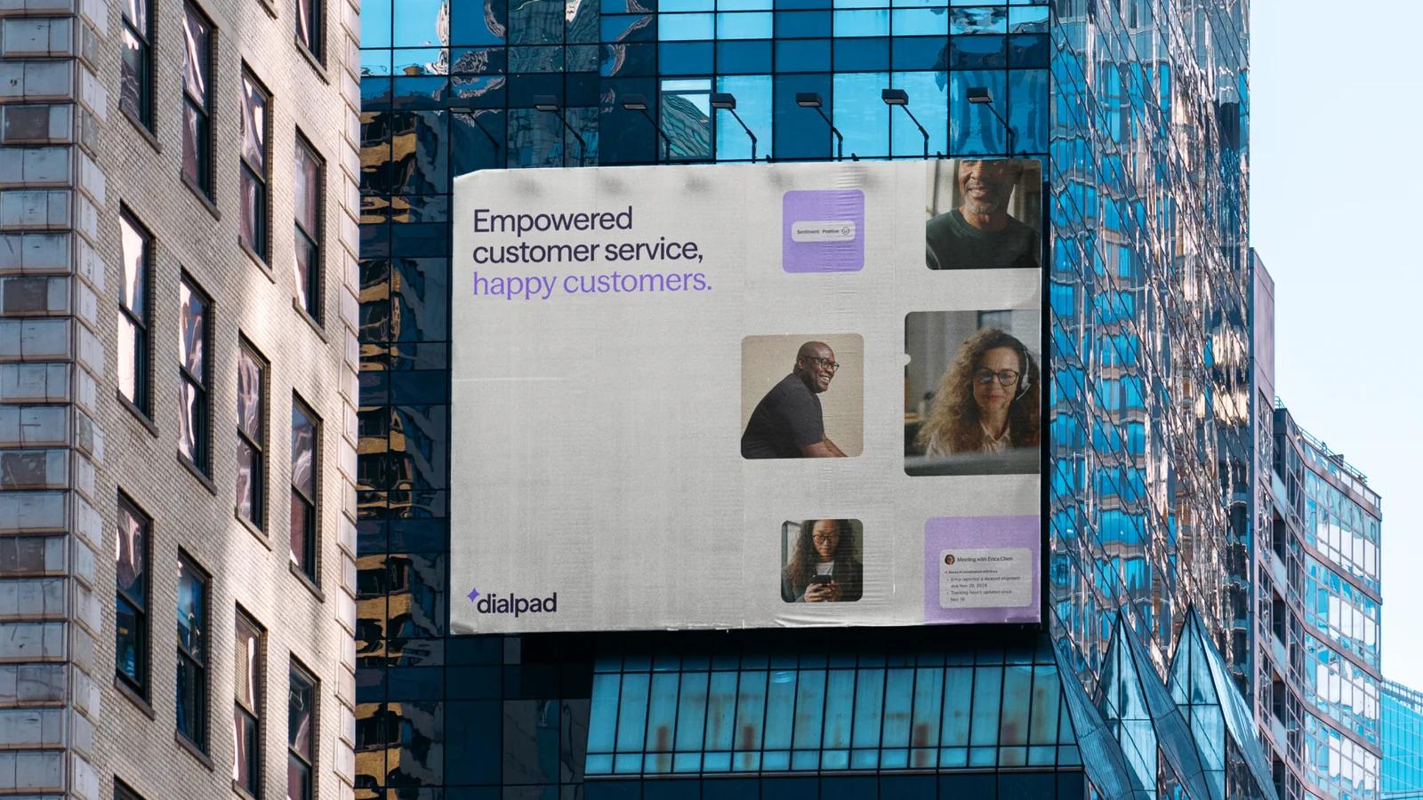
Every application mapped back to a stage of the journey, from an airport billboard at awareness to the product itself.
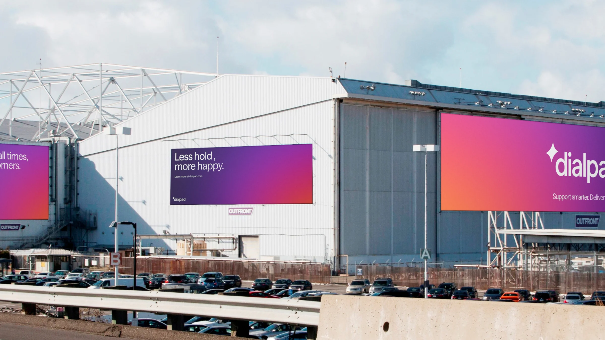
Billboards on a hangar beside a parking lot: Less hold, more happy.
A building wrap: Empowered customer service, happy customers.
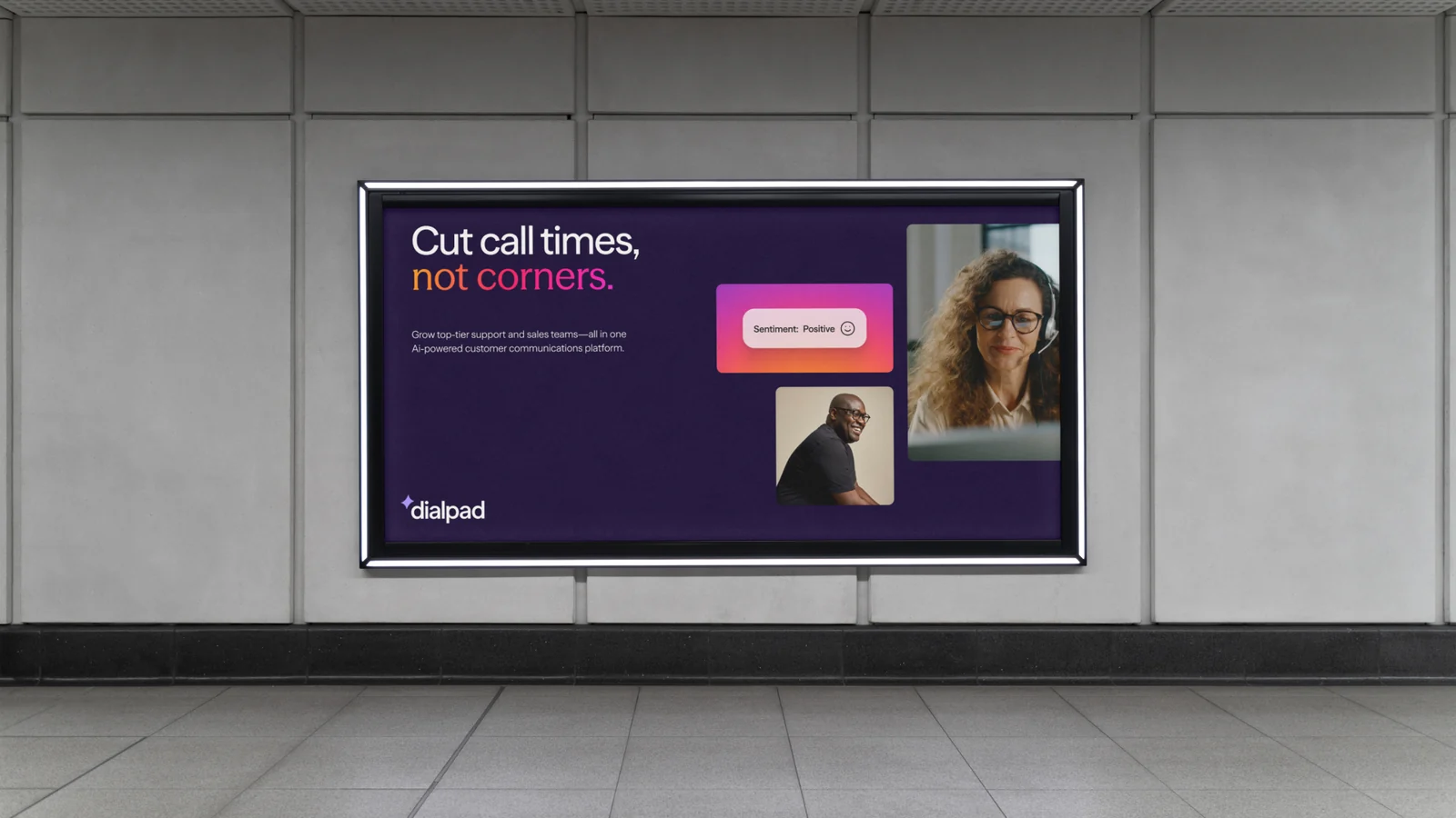
A station poster: Cut call times, not corners.
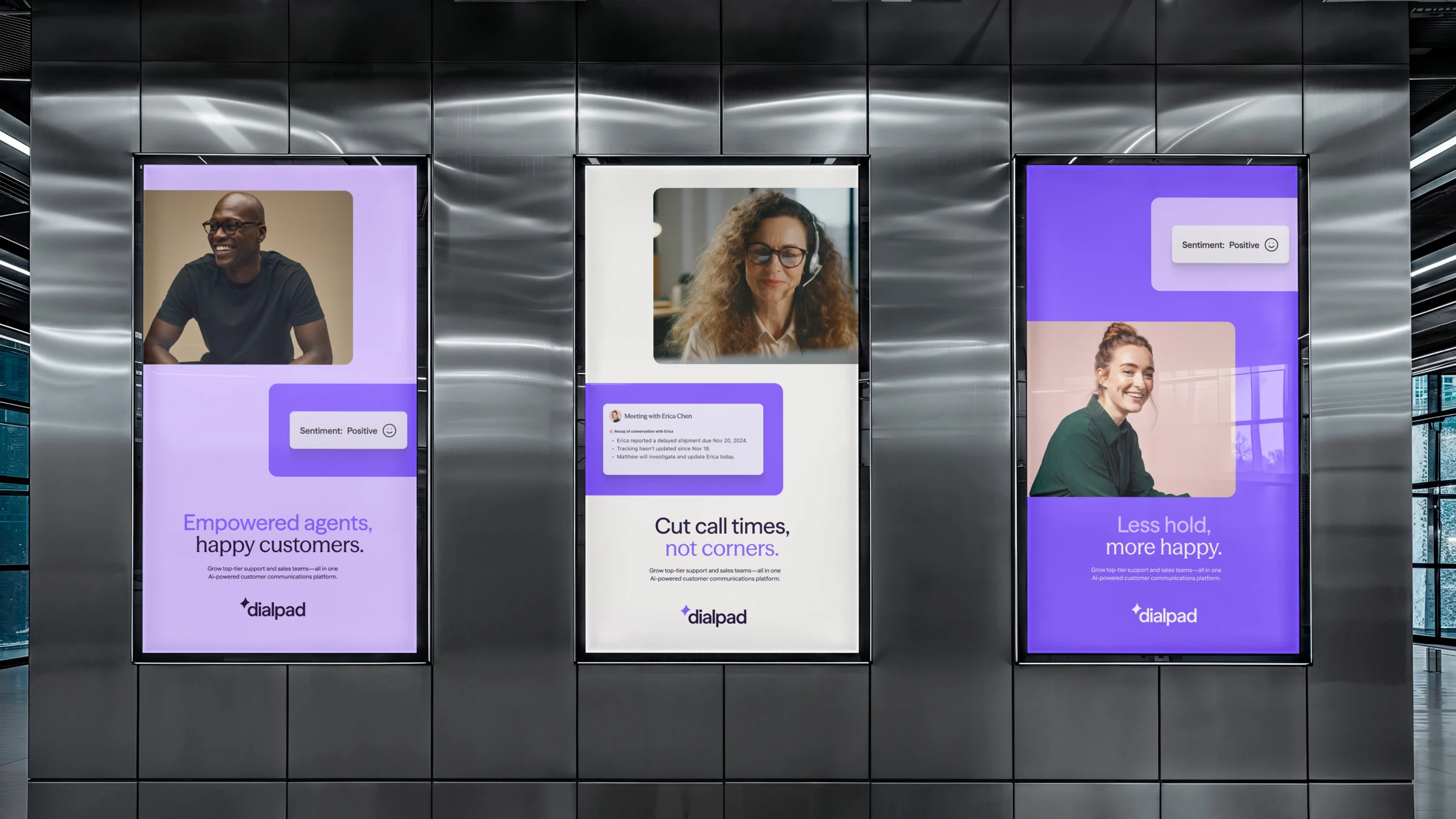
Three portrait posters between steel elevator doors
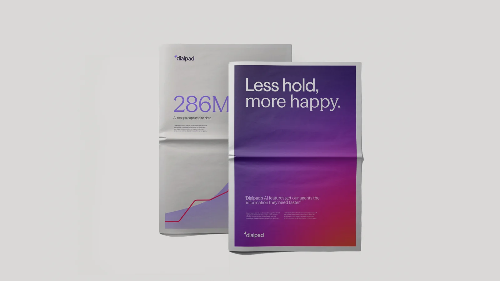
A newspaper wrap: Less hold, more happy.
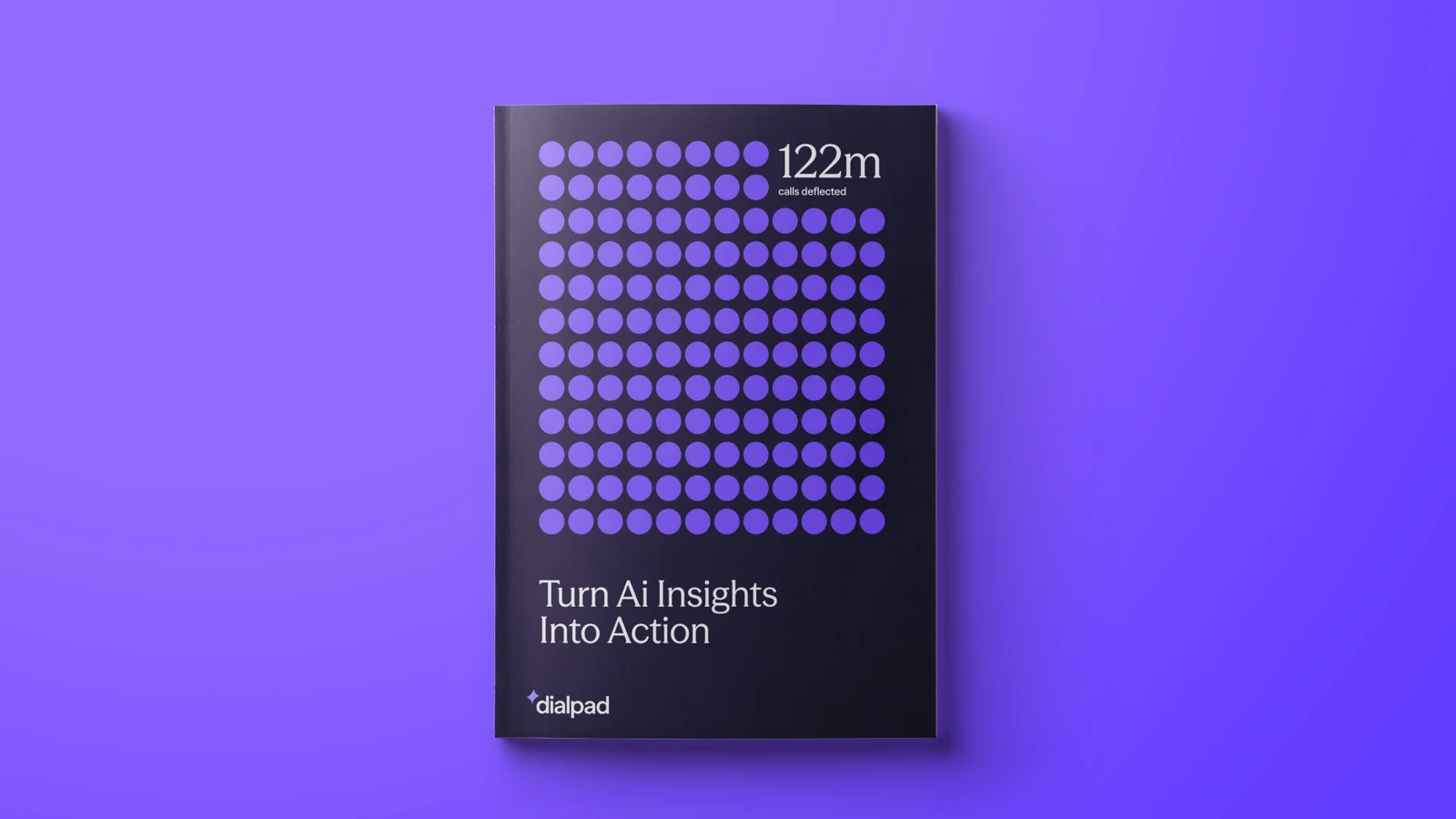
A printed report: Turn AI Insights Into Action
The website homepage: Empowered agents, happy customers.
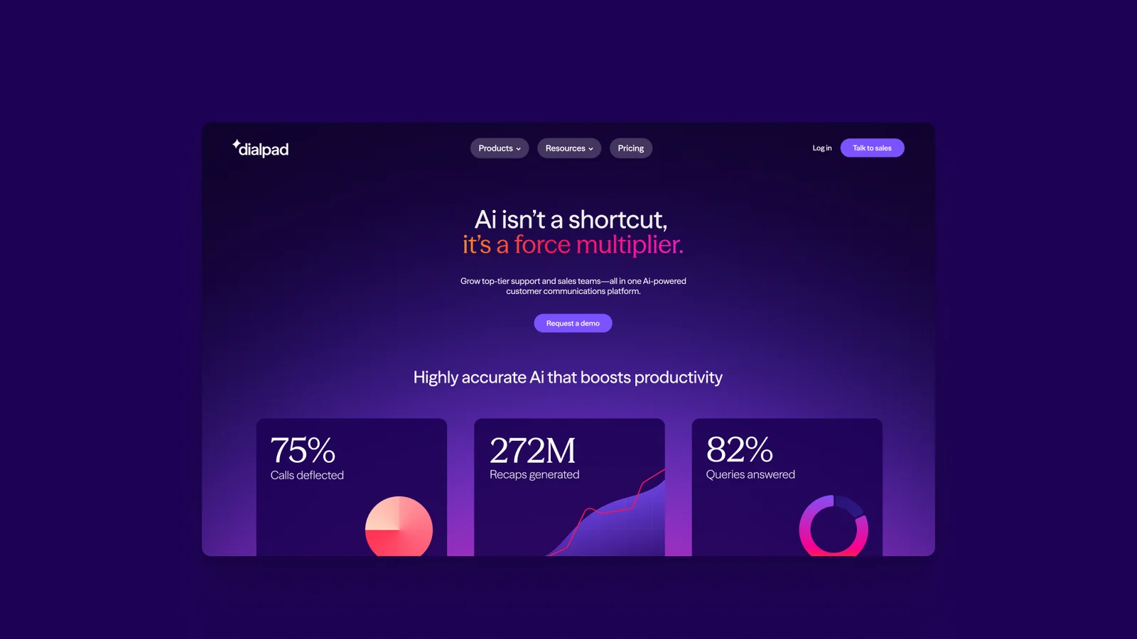
A dark product page: AI isn't a shortcut, it's a force multiplier.
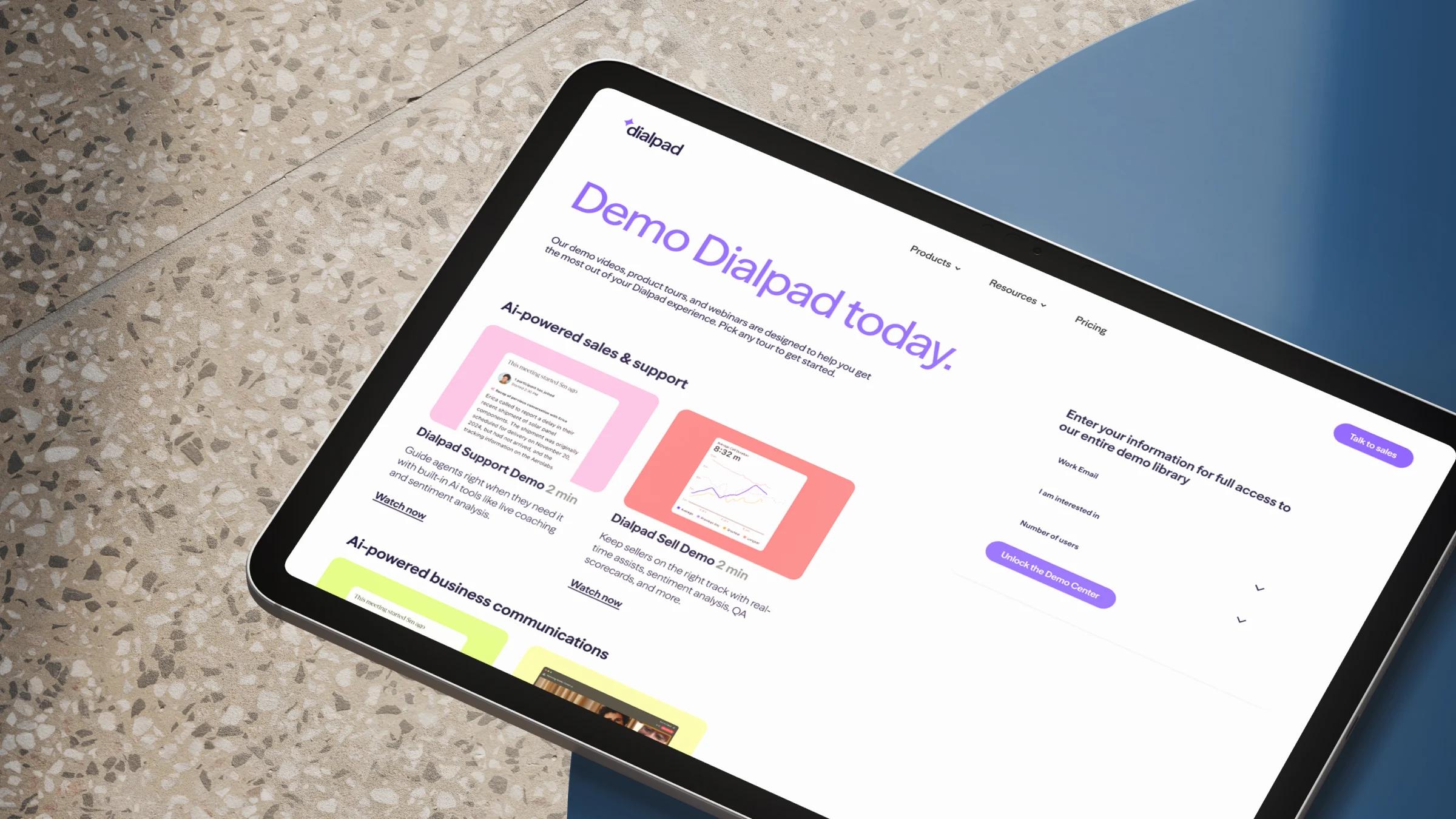
The Demo Dialpad today page on a tablet resting on terrazzo